


The New Iconic | A Retrospective of Seventh Edition
Seventh Edition is a Magic icon. From the old-school frames to the fancy foils and the hit-or-miss illustrations, this enormous core set remains a beloved mainstay of the game’s history and culture.

Watch the full presentation here
This episode is sponsored by Card Kingdom. Head to cardkingdom.com/studies to pick up all your favorites from Seventh Edition. Check out the Rhystic Studies landing page as well, which includes a curated list of my favorite cards and accessories to browse and purchase. Thank you Card Kingdom for the support!
I’m a proud member of team BASILISK, an e-sports organization on a mission to inspire scientists through the study and play of difficult games. Fellow Magic enthusiast and science educator Kyle Hill recently joined the squad, and I’m happy to extend him a heartfelt welcome. Thank you BASILISK for the support!
The Starter Kid
People always ask, “how did you get into Magic?”
I remember it vividly. It was the summer of 2002. I was 11 years old. It was tradition that I spent June and July with my grandfather in the mountains of West Virginia. Being out there meant a lot of time playing in the woods, listening to bluegrass, and reading.
That summer was special: before we drove out to Elkins, my great-aunt Lois gifted me some booster packs of Odyssey and Judgment and a Seventh Edition Starter Kit. My older cousin Kyle loved Magic, so she figured I might like it, too. But we didn’t have a computer out there in the countryside. So all I could do was stare intently at these strange game cards. It didn’t matter that I had no idea how to play, or even someone to play with – the illustrations were enough to hold my imagination for weeks on end. I was mystified by these creatures and their weathered relics and their sorceries, so much so that I drew a few of my favorite images with pen and pencil: Merfolk of the Pearl Trident, Raging Goblin, Lava Dart. This is how I passed the time, lost in the landscapes of other worlds.
At the end of that trip, we returned to my great-aunt’s house in Falls Church, just outside of D.C., and I could finally load up that CD-ROM that came with the starter kit into her laptop. I can still hear it spinning in the disc drive and the fans humming loudly. Only then did I learn, step-by-step, how to play Magic, how to put lands onto the battlefield, one per turn, how to tap creatures and move through combat and how to be patient with your Lava Axe until your opponent is at five life. To think just how much changed for me that day without me knowing it.
23 years later, as I pull the very same Thorn Elemental that came in that box set out of my binder, I wonder how much of my admiration for 7th Edition is tinted by this nostalgia. I wonder what this enormous core set may reveal about Magic at the turn of the century – its aesthetic identity and its design choices, and all the business decisions that guided development behind the scenes. I wonder how much has changed for the game, and I wonder how much has stayed the same.
Old Frames & New Foils
As the name suggests, 7th Edition was Magic’s seventh base set, a collection of 350 reprinted cards released in April 2001. The file contained a clean 110 rares, 110 uncommons, 110 commons, and 20 basic lands, four of each of the five types. I originally believed that 350 was a clever little easter egg, with 3.5 being half of 7, but Sixth Edition also contained the same number of cards. Too bad.
Unlike Sixth Edition and its two predecessors, Seventh Edition broke away from the Roman numerals for its set symbol, sporting instead a stylized and serifed “7.” This detail remains one of its most enduring qualities and, in my eyes, a trademark of its iconic status. Set symbols are powerful mnemonics. In the history of core sets, this one stands alone.
Branding and marketing took advantage of the “7” and all of its connotations, while the creative team looked at potential through-lines to tie the set together with a small-scale story. They narrowed in on a battle between the factions of the four Paladins, with Northern and Southern Paladin representing the Light side, and Eastern and Western Paladin fighting for the dark. Never before did a core set feature any sort of narrative, and nor would any again until Magic Origins in 2015.
The flavor text on 23 cards recite the skirmishes between the Paladins. I appreciate the citational interplay between the four namesake characters: the Northern Paladin is described on his card with disdain by his enemy in the East. The Eastern Paladin, then, is accused of being sickly obsessed with death by his adversary in the South. “How can anyone fight so much yet enjoy it so little?” accuses the Western Paladin of the Southerner – this quote frames the latter’s nobility. The former, however, is nothing more than a scornful liar according to the Northerner. This circular dialogue is an evocative storytelling technique that rewards any player who gathers together all four of the Knights.
Similarly, Infernal Contract, when paired with Glorious Anthem, completes the two stanzas of the Ballad of the Paladins. In this illustration by Pete Venters, we also see the plot gimmick at play: each of the four Paladins have sacrificed their vision for a magical gemstone that enhances their spell-casting abilities. As such, they are all depicted missing one eye. In the cloudy sky of Spirit Link by Daren Bader, for example, we can see that gemstone glowing in the socket of a distant observer.
Now, perhaps this is all a bit too contrived for your average Magic player. Who could have ever pieced together these concepts without a guide or an accompanying booklet? Remember, we’re still in the proto-Internet era in 2001. It’s not like aspiring Vorthoses had readily access to the lore Wikis. No, players don’t look back on Seventh Edition with fond memories of the battle of the four Paladins.
They look back and remember the foils.
Alongside being the first core set to incorporate an overarching narrative, Seventh Edition was also the first core set in Magic history to feature foil cards. These were still a relatively new addition to the collectible hobby – foils debuted in Magic in September 1998 with the distribution of Lightning Dragon at the Urza’s Saga prerelease. The following set, Urza’s Legacy, was the first major expansion to offer premium foil versions of standard cards. Players were slow to embrace the change, but Wizards knew, in the long run, that foils could signal status and dedication between the enfranchised. By the time 7th Edition rolled around, the culture had been established, and the majority of both players and collectors were opening booster packs with elevated hopes of finding the glimmer within.
The tricky part, however, was that foils fundamentally conflicted with Wizards of the Coast’s reprint policy. In 2001, the company was still burdened by their promise to print the first edition of any new card with black borders and any subsequent editions with white borders. Seventh Edition was a core set, meaning that 100% of the file was made up of reprinted cards that already existed in circulation. Therefore, they were required to carry white borders. The problem was that foil Magic cards could not have white borders – in my investigation into the offset printing techniques used to manufacture trading cards, I discovered that the thin layer of holographic polyester laminate is glued on top of the white cardstock, covering it entirely. As such, if not for the extra rollers of black ink applied to the borders at the printing facilities, all foil Magic cards would have shiny, silver borders.
To solve this dilemma, Wizards took a chance and printed every Seventh Edition card with both borders – non-foils in white, and foils in black.
And the foils were rare, too, much rarer than they are now. On average, players could expect to find only one foil rare in roughly every booster box. Given that Seventh Edition did not sell as well as its neighboring expansions, which contained much stronger cards on rate, some collectors believe that the total supply of the set’s foil rares is equivalent to the print run of Alpha. Applying this low drop rate to highly-treasured cards from Magic’s past transformed select cards into coveted keepsakes. Adding to this, the release of Eighth Edition a couple of years later brought all-new card frames, which further elevated Seventh Edition foils in the public eye. Players looking for premium versions of core set cards with the pre-modern frames had but one choice. For some cards like Crimson Hellkite and Stronghold Assassin, this limitation still applies.
By 2003, foil Seventh Edition Birds of Paradise commanded a $100 price tag according to Scrye magazine. In the two decades following, it has quietly become the most valuable ungraded holographic Magic card in the game’s history. Final Fortune and City of Brass are in similar company. Even throwaway commons are typically worth a couple of bucks in foil. They’ve aged well in both quality and appeal, and there’s just something about that black border with the shooting star that really brings it all together. To say nothing of the old-school artifact frame.
Now, in writing histories, we sometimes confuse what our topic has become with what it is and what it was. We tend to associate Seventh Edition with its costly foils now, but 11-year old me wasn’t looking up price guides and speculating on card values. We weren’t falling in love with Magic because it was expensive. We fell in love with Magic because it represented the gold-standard of high fantasy. Even if we didn’t know how to play the game, we all felt that these cards contained something just beyond our reach.
Wizards of the Coast, however, was keeping a close eye on the secondary market. The black border was more than just a printing limitation – it was a symbol of a handshake agreement between the company and the players, a deal that both parties would soon come to renegotiate.
Testing the Contract Waters
In The Duelist Issue #10, published in May 1996, Wizards of the Coast began entertaining the possibility of printing new illustrations on old, classic cards. “We’ve been kicking around various ideas for improving the next rotation of the base set. One of the suggestions that’s come up is commissioning new art for some or all of the cards.” (111) In the following issue, letters poured in to headquarters expressing both sides of the hotly-contested debate.
“Just as you did with Ice Age, change the artwork. It gets boring always seeing the same pictures,” wrote Bryan Rhodes from Keene, New Hampshire. “I love Anson Maddocks’s art, but if Mark Poole did a good rendition of Sengir Vampire, I would play with both his and Anson’s.” (11)
“Change the artwork? Have you gone mad?” countered Ron McIntyre from Pittsburgh, Pennsylvania. “Longtime Magic players can spot these cards on sight. Not only does this speed up the game, but it adds a certain comfort…The consistent artwork is also a big reason why Magic breaks the language barrier.” (11)
Lingering in tandem with this question was the presence of the Reserved List, which coincidentally appeared for the first time in print in Duelist #10 as well. Beginning in Ice Age, Wizards started experimenting with this gray area of “old card, new art.” They wanted to know if doing so would conflict with the spirit of the reprint policy. It started with innocuous cards like Sea Serpent and the Circle of Protection cycle. But what about the heavy hitters like Birds of Paradise and Prodigal Sorcerer and Shivan Dragon? Could you reprint these iconic staples with new illustrations without upsetting those affectionate to the originals, including the illustrators who still owned rights to the images?
Legal conflicts with artist contracts motivated these questions, too. To help explain, I called Magic art historian and analyst Mike Linnemann.
“In 1996, Mirage happens, and Mirage is the start of the new contract…We want to do a different expansion set, let’s get a new contract in place, and what that did is it replaced the previous royalties contract…If you want to get Magic in the future you have to sign this new thing. Your royalties will end. The new one will be work-for-hire. You get paid for a thing, Wizards owns all the rights and you have some carve-outs where you can make prints and things of the sort, and that is the new normal largely because one: of cost, and two: because there is nothing else in society that can sustain that at the scale they were printing. You’re making 100 million cards, it just doesn’t work. The business won’t work. The numbers don’t work.”
As Mike stated, the original Magic artists before Mirage were paid royalties every time a card was reprinted. Because Magic was so successful, payroll and accounting became encumbered and could no longer sustain the previous business model. So they developed new contracts that paid artists a flat fee in exchange for full rights to their work. This has been the format for freelance agreements ever since.
“So at that point, Mirage happens. That’s where we get the John Boltons. We get the Donato Giancolas. They knew about good artists in ’93, ’94, ’95. They just couldn’t afford them!”
Fifth Edition had some new illustrations here and there, and Sixth Edition did too. Wizards stayed testing the waters and monitoring the responses, always remaining within the bounds of low-profile cards. Seventh Edition, though, marked a bold leap into the deep end. To really put the stress test on reprints, they abandoned caution and commissioned all-new art for every single one of the 350 cards in the set. No longer were the game’s most recognizable images immune to change.
The results were mixed and mostly unfavorable.
Birds of Paradise was mocked for looking too much like a parrot. Prodigal Sorcerer lost all of its Douglas Shuler charm – still to this day, I’ve actually never seen this version in the wild. Serra Angel wasn’t Serra Angel, Counterspell wasn’t Counterspell, Wind Drake and Wood Elves and Worship were just generic derivatives of the classics that the old guard admired from the early years. Coat of Arms was especially maligned; given the lack of flags and banners, it read as unused slush art from a previous set. Seventh Edition’s poor sales have always been attributed to this visual whiplash. It’s hard to offer a nostalgia that is unrecognizable to the nostalgic.
But what if catering to veteran taste was never really the central goal? What if the black-bordered foils were a scapegoat, a distraction from other motivations at play?
“If you reprint Serra Angel, will it make the previous values of cards go down? Will it make Serra Angel Alpha, Beta, Unlimited go down, or go up? What will happen? What happened? Obviously, if you reprint Serra Angel in Standard, who’s going to play the 7th Edition version? Let’s play the blinged-out Unlimited, obviously, with the bright color! Don’t get the Revised in here, gross, I’m talking vibrant. That’s what people did, they brought their old cards back and then those raised in value. But, it was assumed it would drop the values of those because there’s more of them. But what Wizards figured out is, when you do different artworks, eventually people like certain artworks. They get nostalgic to it.”
In an article titled “Re-examining the Reprint Policy” published in March 2002, Wizards highlighted this exact phenomenon. To their apparent surprise, card prices of old Serra Angels skyrocketed following the distribution of Seventh Edition. In turn, they argued for a revision to the Reserved List, claiming that “the Reprint Policy is doing the exact opposite of what it was designed to do. It was designed to enhance the value of the cards you collect, but instead it could be suppressing them!” Their logic followed that perhaps some cards would benefit from falling off the List.
“…and Seventh Edition was the test for that. And it was spun as a ‘new art, new is cool, we’re going to try it out, oh and you get foils!’ And players didn’t quite pick up on the legal-ese, contract, Reserved List aspect of it. They just thought, ‘oh, new art, I don’t like that art, some other ones I do like, cool.’ And then we moved on.”
The article concluded with yet another testing of the waters, pitching a group of 22 cards that could potentially be cut from the Reserved List and reprinted in future sets. Two months later, Randy Beuhler officially announced the exclusion of all Alpha and Beta commons and uncommons from the List, which included fan-favorites like Clone, Juggernaut, and Sol Ring. To think of all the ripple effects emanating from Seventh Edition and overlapping with the core foundations of the game’s biggest format. To think how many game stores have survived for thirty years because Sol Ring is $2 and not $2,000.
So, to recap – Seventh Edition proved that the white-border, black-border dichotomy was losing its efficacy and its staying power, that players would return to older versions of cards in the face of reprints as a sign of their dedication to Magic, and that the Reserved List was more malleable than it seemed. Even though folks were cold to the set upon release, the advent of assigning 350 individual pieces of new artwork was a significant measure of growth from the game. It showed a willingness to remain unbound to its past, even if its past was still bearing fruit. This decision resulted in the production of some of Magic’s greatest paintings from living and working masters, including a select few from a growing star based in New York.
The Emergent Donato Giancola
Walking firmly across the library room is an educated woman donned in purple silk and cobalt armor. She casts a pensive glance in your direction, a signal that her research is not to be interrupted with mild conversation. Behind her, a painting of the sea is framed in ornate gold. The crashing waves mirror her accelerating thoughts. They offer a vision into her hyperactive mind, one disquieted by the scrolls and tomes tucked beneath her arms. She is busy.
This is Archivist by Donato Giancola, painted in 2000 and first printed in Seventh Edition.
“I am Donato Giancola. I am an illustrator, commercial illustrator. I’ve been working with science fiction and fantasy since the first year I graduated from Syracuse University…I have a lifelong love of the genre. It’s not just my professional experience. I am a huge fan of the genre.”
Donato Giancola was among the first class of artists ushered in by the Mirage contract changes in 1996. His first card, Amber Prison, was a quiet showcase of his style, a piece in oils with a palette of earthy tones and a rich attention to detail. At Syracuse University, he studied figure painting, architectural rendering, and classical realism. Upon graduating in 1992, he moved to Brooklyn with ideas of becoming a comic book illustrator. But a chance encounter with his soon-to-be agent Sal Baracca opened the doors to professional illustration by way of book covers. A couple of years later, at a convention in Philadelphia in 1995, Donato discovered Magic.
“So we set up at the table…and then a couple booths down from us, there is this guy and he’s swarmed with people. People lining up for his signature. We have a couple coming by our booth, and this guy’s got perpetual lines the entire time at the convention. Like, ‘who is that, and what is he doing? Because he’s got something going on!’ And that was Bryon Wackwitz.”
“So we go out to dinner that night, first night of the convention. Bryon sees my work, and Bryon says, ‘you should in send your work to Wizards of the Coast. The game that I’m doing, the people that want all these signatures from me. They would probably love to have you do some jobs for them.’ And that was my introduction to Magic.”
Within Donato’s earliest commissions are a group of cards that feature close-up renders of highly expressive hands. Human hands can be notoriously difficult subjects, but Donato learned by replicating masterworks and absorbing their solutions to such illusions.
“I love hand paintings. They’re very expressive. For me, hands are like portraits. They can reveal the unique identity of the person that you’re attempting to represent…This is kind of funny. I gifted these to my parents. And here we have Crystal Rod from Fifth Edition, and right on the other side is Iron Star. So that was my mother’s hand and my father’s hand for Iron Star.”
Gerrard’s Wisdom zooms in on an adventurer vigorously pointing at the schematic designs of The Weatherlight. Beneath the ruffled papers are layers of blueprints and maps filled with tiny technicalities lost at card size. Another key feature of Donato’s paintings are the paintings within them, the layering of worlds within worlds. This narrative device is deep-seated in his love of roleplaying games and map-making for his campaigns.
“Weatherlight’s like a high-tech ship in the world of Magic. It’s kind of appropriate that they would step up their designs for it.”
Worldbuilding is a balancing act between exposition and suggestion. Donato implies a paradigm-shifting technology with a few red lines on weathered parchment. Once again, it is the hand that directs our attention, as if to say, “This ship can fly – look how marvelous it is! Look at what we’ve built.”
Just as well, Donato goes back in time to admire the innovations of the medieval.
“This one in particular was inspired by a visit to the Pierpont Morgan library. They have these giant choir books…medieval choir books, which are oversized. And they’re designed for reading from a distance. But I just love that scale, ‘here is a tome. Here is a giant volume of knowledge.’ So I thought, wow, I want to capture that immersion…immersing the figure inside the tome, which is why I used the tome as a frame for that figure.”
Consider the scale of Jayemdae Tome. Consider the meticulous effort involved in painting every single gold leaf, every stem, every berry. Consider accounting for the gentle curve of the page, and how that may influence the shape of the script, and how every letter is transcribed in a consistent cursive, with some lines fading into palimpsests, true to the source material. Remember that these books are ancient, and heavily used, and so some of the pages have been torn through and fused back together. And then consider the miniature scenes within the book, more paintings within paintings, how they further suggest worlds within worlds. Consider doing all this for a single Magic card.
To think this wasn’t even the centerpiece of Donato’s portfolio for Seventh Edition.
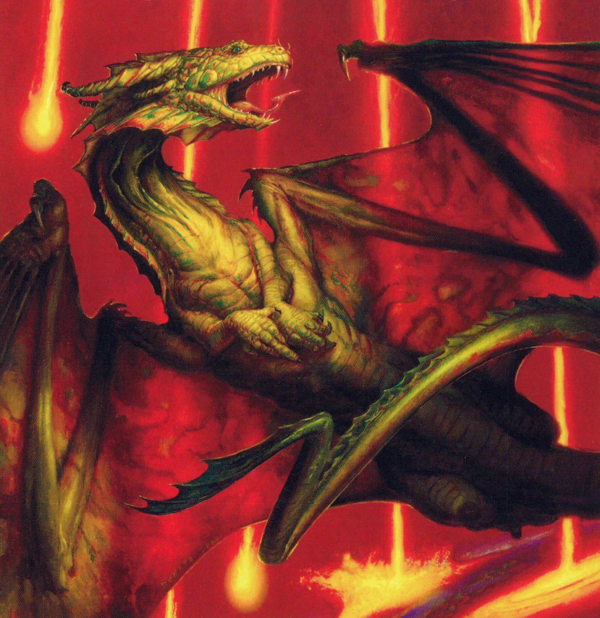
Prior to this commission, Donato had only yet made a single dragon for Magic. Informing his designs was his study of evolutionary biology. To him, dragons are flying dinosaurs. They are reptilian and lizard-like, but they also carry avian traits like those found on contemporary birds.
“T-Rex was – all the velociraptors – they were four-legged walkers at one point. This is Shivan. Shivan maybe had those longer, four legs before. But it’s a flier, so the evolutionary energy went into the scapula structures. So they broadened out, they projected out, so the management hands became smaller. The third set of limbs became smaller and smaller. So that’s my science mind trying to resolve a little bit of that.”
“For me, they’re not animalistic…they are highly intelligent, cunning, powerful, dangerous. So that’s how I approach that, that’s the basic line.”
Donato was also keenly aware of the first interpretation of Shivan Dragon by Melissa Benson and was intentional in creating a visual through-line for its second appearance.
“My nod to her was the green-ish coloration. Shivan Dragon is a red creature, but it’s green on the card. So I gotta make this a red card, but I gotta have green on the dragon, because that’s what Melissa Benson did. Even the cheek, the webbing and ribbing leading from the side of the jaw line and down the neck was an homage to her as well. So I wanted to have a continuity for the players so that they could say, ‘oh, here’s some linkage, this is not just some fanciful, new interpretation, but there’s a connection to the history of the art for the game.’”
Cascading through the background are meteorites striking pools of lava, the light from which illuminates the translucent skin of the wings. There’s so much style and energy in this painting. Donato rose to the occasion with hopes his Shivan Dragon could stand the test of time. Remarkably, the painting was sold to a collector before it was finished – it seemed that others also knew it had the same potential.
“For Donato, that was the piece that he brought into Magic the became known for. So by him having that front-and-center, it’s gonna stay for the next couple core sets, and it’s still being printed every now and then. He knew at the time this was going to be sticky. He knew it was going to stick around for a long long time.”
As of November 2024, Donato’s Shivan Dragon for Seventh Edition has been reprinted 18 different times, including most recently in Magic Foundations. While the owner of the original painting remains unknown to me, I have seen Archivist in person. It hangs proudly in the home of my mentor and my guide, Mike Linnemann. He bought the painting when he was broke and still in grad school. But he was acutely aware of its quality and the artist’s eventual significance to Magic history.
It’s amazing to me how we’re all connected by a card game. It’s amazing still that real paintings exist of the tiny printed images I’ve kept in my closet since my youth. Sometimes that connection isn’t so obvious until you’re standing in front of the framed work, and you can see all the textured brushstrokes layered onto the hardboard, the invisible hand of the artist made permanent.
High Fantasy in Fragments
Among the many pieces that caught my eye while browsing the Seventh Edition card gallery is Creeping Mold by Gary Ruddell. A somewhat unremarkable uncommon, this painting depicts an ivory castle drowning in a rampant fungus. In the middle ground, the silhouette of a robed wizard casting a spell emerges from the edge of a stone staircase. The sky is blue and the trees are lush. Its companion piece in Nature’s Resurgence, also by Ruddell, offers another angle of a similar scene. Both of these cards are quintessential high fantasy and fixed at the tonal center of Magic in its early years. They could double as setting inserts for any given sword-and-board tabletop rulebook or CRPG of the era.
Seventh Edition is full of such cards. As a consequence of commissioning 350 new illustrations for the set, we have a time capsule of the genre as it was imagined in 2001. Stylistically, the set is fragmented. There were no world guides or mood boards or reference sheets provided to the illustrators. There was very little hand-holding either; Donato told me that all Wizards wanted from Shivan Dragon was “to make it look cool.” In essence, Seventh Edition is a collection of professional illustrators expressing their own visions of high fantasy – what it is and what it could be. It is eclectic and unbound and sometimes a little kitschy. But it is just as rich and vibrant and alive as well. It is no wonder why these cards have held me in a vice grip all these years.
Grafted Skullcap, for whatever reason, has been etched into my deep memory. It takes me back in an instant to my discovery of Magic that summer. The flavor text I recall vividly – only now do I understand it as an expression of the card’s mechanics. But its poignancy remains: “Every day, I fight for my life and win. Every night, I fight to remember my name and lose.” Seventh Edition is filled with lines like these, poetic reflections and worldbuilding snippets and even excerpts from literature. Magic would soon move away from this tradition, but certain cards like Wind Drake are all the more elevated by the presence of these quotations.
“But high she shoots through air and light,
Above all low delay,
Where nothing earthly bounds her flight,
Nor shadow dims her way.”
That is the Irish poet and lyricist Thomas Moore. What a lovely turn of phrase.
How about two lines from ‘Mortality’ by the Scottish poet William Knox? “A flash of the lightning, a break of the wave, He passes from life to his rest in the grave.” Such words describe exactly how this class of creatures behaves: they strike quickly with haste, then die, either by losing combat with their one toughness or through sacrifice at the end of turn. Kev Walker’s hellish skeleton is another image that remains burned into my memory.
While Magic enjoyed evoking the likes of Samuel Coleridge and William Shakespeare in flavor text, the game’s creative writers were also establishing motifs and conventions of their own. One such device that reappears a few times in Seventh Edition is the regional proverb:
“A fruit must rot before its seed can sprout – Yavimaya saying.”
“Beware anything born among the dead – Tolarian saying.”
“Seek balance in all things – as long as the scales are weighted in your favor – Vodalian saying.”
“Even the grandest forest begins with a single seedling – Llanowar saying.”
Such lines serve to pique curiosity in readers unfamiliar with Magic lore. If these are commonplace expressions, we can begin to infer about the people who repeat them. “Watching the spider’s web,” to the elves of Llanowar means “focusing on the wrong thing;” “Why not ask the winds?” repeat the scholars of Tolaria to dismiss a wayward question. Squabbling with Vodalians is “Like arguing with ice” – a waste of time, in other words. I’ve always found these sayings so charming. They are the italicized marginalia of a D&D character guide, the NPC dialogue of EverQuest or the loading screens of the Elder Scrolls.
The color-coded creatures of Seventh Edition stay firmly in line with the traditions of these foundational games, too. Everything is as you might expect: the soldiers in white are plentiful defenders of their hearth and home. They are courageous and noble, and “they fletch their arrows with the feathers of angels.” Blue is filled with birds and wizards, plus the occasional sea monster. Black has skittering insects and specters and skeletons, the latter of which had to be heavily censored for the game’s release in China. Strict media laws resulted in a legacy of covering up bones. Red’s goblins, are, of course, pea-brained and clumsy, yet aggressively determined. Green has beasts and druids and elves who defend the forests. Once again, this is high fantasy 101. Nothing is out of place, nothing stands in opposition to genre conventions.
Thematically, this is why Magic’s core sets endure. They are evergreen in their trappings – Grizzly Bears and Hill Giant and Sage Owl are eternal concepts. Even the battle of the Paladins is a timeless tale. There are no superhero-esque Planeswalkers or overly-designed legendary heroes or gimmicky McGuffins to guide you – just a classic power struggle between opposing forces. Little beyond flavor text describes the feud or its outcome; Seventh Edition provides the chess pieces, and it is you who moves them into position across the squares.
The set does show its age in certain spots, though. Mike takes note of the cards that didn’t hold up to previous and subsequent reprints.
“Seventh had mistakes. Actual mistakes. And you can see it where cards were tied too much to the previous and it made it stiff. Because it’s like, ‘oh I gotta make it a similar concept, feel the same.’ No! Don’t do that. It makes worse art. And this is the example that is stark, when you do that, this is what happens…and when they did change it too radically, it immediately changed in Eighth Edition. So for me, looking back, I often see what changed in Eighth and Ninth, but was different in Seventh.”
Fallen Angel and Llanowar Elves and Giant Spider are among the examples that did not endure. Mark Zug’s Serra Angel, while outstanding, also had difficulties overcoming the iconicity of the original printing. Greg Staples’ version would join the conversation and compete for staying power beginning in Ninth Edition. Evacuation is another strange miss – I’d argue that Franz Vohwinkel’s take for Tenth Edition is now the de facto printing. On the other hand, some cards like John Avon’s Millstone and Ron Spencer’s Unsummon carved out a niche following all their own. I appreciate the callback to Lightning Dragon, too.
Wrath of God by Kev Walker is arguably the most memorable and important image from Seventh Edition. This piece has touched the lives of generations of players. It pays homage to a masterpiece of manga, but stands firmly on its own as an undisputed icon of Magic. Spotting it in booths at conventions and in display cases in game stores always brings me joy – even better when it appears as a flex piece in foil in cubes. It’s a perfect painting on a perfect Magic card, a Seventh Edition success story through and through.
That said, a much quieter piece by Kev Walker has stayed with me all my life.
Patagia is Not a Place
At MagicCon Chicago 2024, Vorthos Mike invited myself and a few art enthusiasts to compile a list of Magic’s greatest paintings for a small seminar. Appearing in the presentation were the usual suspects – Cartographer by Donato Giancola, Surgical Extraction by Steven Belledin, Bitterblossom by Rebecca Guay. My list contained, to some surprise, Patagia Golem by Kev Walker. I made a case for its anachronistic concept – a flying robot in Magic – its simplicity and legibility at card size. Kev’s work is always so well-rendered and evocative, even when he’s using minimal shapes and expressions.
The truth is, this has been my favorite painting in Magic since I was a kid. If that Starter Kit did anything to stir my interest in the game, Patagia Golem ensured I would remain here for life. I think everyone can point to their own such examples. Patagia Golem was also part of the collection of sketches that I made that summer in the countryside and have kept with me ever since. Patagia, by the way, are the membranes of skin linking the limbs of gliding mammals. I didn’t know that when I was young; I just thought this automaton came from some far-off place with a cool sounding name.
Inspired by my younger self, I decided to pick up a pen and try my hand at drawing this card again. Maybe now I have more control over the proportions and the detailing. Maybe now I can better describe what I appreciate about this piece. But the innocence preserved in that first drawing is too tangible and too genuine. I cannot describe what I felt back then, spending my summer staring at Magic cards. What remains here, in the unkempt wrinkles of graphite on stray printer paper, is a boy lost in his imagination, suspended in a world within a world.
GOLDSABERTOOTH Kickstarter
My final sponsor for this episode is the Commander Pantheon campaign on Kickstarter. This collection is a grassroots effort by the ascending community artist Goldsabertooth, whose dynamic style is defined by expressive line work, bold colors, and flavorful accents of text. These premium, stitched-edge playmats feature renditions of some of Magic’s most iconic and powerful commanders, including Najeela, Yuriko, Magda, and Sisay. Add-ons include stickers and t-shirts and tokens – there are plenty of packages to choose from that feature combinations of everything offered and more. I really love this guy’s style and I’m so proud to boost the signal on projects like these. So follow my affiliate link below and help an independent artist see huge success with his first major campaign. Late backers are more than welcome, too!
Cutlines & References
I purchased a foil Seventh Edition Shivan Dragon from Card Kingdom for this video. It arrived with what some players mistake as a misprint. Halfway up the card, the foil breaks into two distinct blocks. These are called “cutlines” and are commonplace on cards from this era. The foil sheets were not uniform in size with the cardstock, so occasionally, they would overlap during printing. Cutlines can appear horizontally at different axes across the frame – here’s a signed Serra Angel from Reddit with cutlines dividing the textbox. If you see these on your old cards, worry not. They are a charming feature of manufacturing trading cards.
It is well-documented that early creative text writers would routinely attempt to sneak puns through R&D’s quality control, especially on card names. What is completely unproven is my speculation that Wall of Wonder is an Oasis reference, and that both Beast of Burden and Rolling Stones appear in Seventh Edition. That one surely can’t be coincidence. Shoutout to the secret Jagger fan working at Wizards in 2001, whomever you may be. I see what you did here.
Vorthos Mike was living in Germany during the delayed release of Seventh Edition. He shared with me a funny anecdote that echoed those concerns from the Duelist about changing all the cards’ art.
“I was in Germany in 2002. I was studying abroad in high school…and I tried to play Magic overseas. The problem was, it was Seventh Edition. I couldn’t recognize any of the art! So I’m sitting there like, ‘Oh, I know Magic. Core set, core set. I’ll play a core set, it’s all the same art.’ and I’m like, ‘you gotta be effing kidding me. I don’t recognize any of these damn cards!’ …so I had to piece together what these cards were. So I find that eternally funny that when I’m looking at some of those Seventh Edition cards, I’m thinking of the German versions, and it’s a project I have to do with Scryfall, to get them a bunch of scans…so personally I can see the cards that I played with in Seventh scanned in there. That Seventh, Eighth, Ninth flavor text changes by language, non-English language, and I want that to be better archived for people because you get a lot of deep cuts. That’s maybe a future project that we can all work on.”
Pledge five bucks on Patreon to ensure the production of retrospectives and documentaries like this in future. I appreciate all the support. Thanks so much for watching.
Sources
https://scryfall.com/search?q=%28game%3Apaper%29+set%3A7ed&unique=cards&as=grid&order=name - 7th Edition on Scryfall
https://mtg.fandom.com/wiki/Seventh_Edition - 7th Edition Wiki
https://www.reddit.com/r/magicTCG/comments/14u3x88/why_is_noone_ever_talking_about_seventh_edition/ - Why Is No One Talking About 7th Edition? - Reddit
https://www.reddit.com/r/mtgfinance/comments/vwqqob/wotc_and_artist_royalties/ - WotC and Artist Royalties
https://www.reddit.com/r/magicTCG/comments/46p2ge/a_brief_history_of_the_reserved_list_some_things/ - Brief History of the Reserved List
https://www.reddit.com/r/magicTCG/comments/1dxksit/ seventh_edition_was_criticized_when_it_released/ - Criticism of 7th Edition Art
https://web.archive.org/web/20200824223128/https://magic.wizards.com/en/articles/archive/latest-developments/reexamining-reprints-2002-03-01 - Reexamining Reprint Policy (WotC 2002)
https://github.com/maxmakesmagic/ormos/blob/main/archive/en/articles/archive/2002/07/new-reprint-policy-2002-07-19.md - New Reprint Policy (July 2002)
https://github.com/maxmakesmagic/ormos/blob/main/archive/en/articles/archive/latest-developments/2002/03/reexamining-reprints-2002-03-01.md - Re-examining Reprints (WotC 2002)
https://www.reddit.com/r/magicTCG/comments/psl680/what_are_surprisingly_valuable_cards/ - 7th Edition Foils - Reddit
https://archive.org/details/ScryeMagazineIssue58-April2003/page/n81/mode/2up - Scrye Magazine Issue 58 - April 2003
http://blog.killgold.fish/2015/04/an-interview-with-sue-ann-harkey-magics.html - Interview with Art Director Sue Ann Harkey
https://www.reddit.com/r/magicTCG/comments/iks99m/does_anyone_know_what_this_line_on_the_foiling_is/ - 7th Edition “Cutline”
https://about.dragonshield.com/artist-interview/ron-spears-interview/ - Interview with Ron Spears
https://articles.starcitygames.com/articles/1800-or-bust-what-is-7th-for/ - What is 7th For? - Jim Grimmett (Mar 2001)
https://www.hipstersofthecoast.com/2022/09/top-10-seventh-edition-art/ - Top 10 7th Edition Art - Ryan Sainio (2022)
https://www.hipstersofthecoast.com/2022/09/first-decks-and-introductions/ - First Decks and Introductions (2022)
https://ronspearsart.com/about - Ron Spears Website
https://www.instagram.com/darenbader/?hl=en - Daren Bader Instagram
https://x.com/MTGHistory/status/1248980794523164672 - 7th Edition Animated Intro
http://markzug.com/magic-all-gathered-here/magic-the-gathering/2832798 - Mark Zug - Serra Angel
https://github.com/maxmakesmagic/ormos/blob/main/archive/en/articles/archive/feature/2006/06/milk-and-cookies-ron-spears-2006-06-14.md - Interview with Ron Spears by Matt Cavotta